Smaller. Sillier. Shoddier.
The Kansas City Star unveiled their new look today. The classified and entertainment sections are now "Bolder-Brighter-Better."
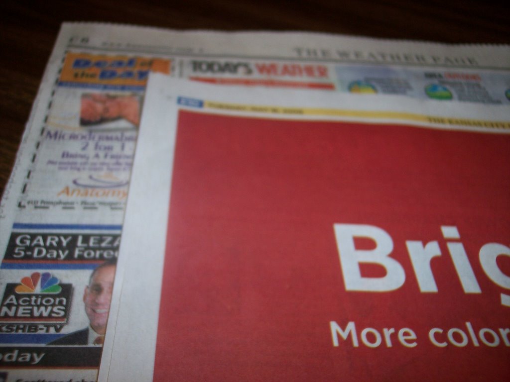
The sections feature more color. And they’re 20% smaller. It’s just like a small town version of USA Today. These changes wouldn’t merit much consideration, but the Star’s marketing campaign has been so overbearing and relentless that I hear their "stargazing" radio ads in my sleep.
Here’s the kicker. Today’s Star informs us that its reduced size makes the paper "easier to handle." The Star must think their readers just fell off a turnip truck.
posted by Happy In Bag @ 11:53 AM
![]()
![]()


5 Comments:
At 1:07 PM, Anonymous said…
Make it Auto Trader-sized, staple the damn thing, and be done with it! :D
At 1:37 PM, Happy In Bag said…
Panos, it certainly seems headed in that direction.
As long as I'm whining about the Star, I'll mention that they have another marketing campaign encouraging people to make kansascity.com their home page. Don't they realize that those infernal pop-up ads negate the possibility of any rational person doing this?
At 10:17 PM, Anonymous said…
not only are the poop-ups retarded - kansascity.com isn't all that user-friendly. i hope part of this new campaign is a site re-design that doesn't try to overwhelm with so much linkage.
At 11:00 AM, Happy In Bag said…
Did you notice that they now have a page linking a couple dozen area blogs? I'm not listed, so I don't have to think twice about my feeble attacks on the instition.
At 11:08 AM, Happy In Bag said…
Institution. I could use a Star editor. Or on second thought, maybe not.
Post a Comment
<< Home