Dear
Kansas City Star Readers' Representative:
I thoroughly consume
The Kansas City Star, my hometown newspaper, every day. It used to be a pleasure; lately it’s become a chore.
Perhaps my thoughts on your recent product will instigate improvements. I’ll limit my comments to the front section for today. I’m not a journalist or an art director. I’m just your customer.
Take a fresh look at
your front page- it doesn’t take a design expert to see that it’s a mess. All those blocks of colors are ridiculous. Remember- just because you have a fresh box of 64 crayons doesn’t mean you have to use all of them on every page. That yellow block of text about Mark Gubicza is especially appalling.
It’s bad enough that you reduced the size of the
Star by 20%, but to use up more than a fifth of the front page with those silly teasers at the top is just plain wrong. Yes, Uma Thurman is mind-numbingly attractive- but what is she doing on the front page? I’ll admire her picture when I read the FYI section, just like I’ll read about Gubicza when I peruse the sports section. It’s an annoying waste of space, and you repeat the blunder daily.
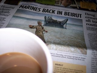
Look what happens when you misuse space- the front page has only four stories. Four! That 5x7 picture of Beirut and the three "idiot blurbs" beneath it don't constitute a story. How can you run the banner headline "Marines Back In Beirut" with a huge photo and not have an accompanying front page story? That’s just dumb. To make things worse, the two compelling stories of local interest- Mark Morris’ excellent investigation of mortgage fraud and Scott Canon’s report on a Shawnee man in Iraq, are buried by your messy design.
There are more unsightly idiot blurbs at the bottom of the page. They refer to seven stories elsewhere in the paper. Again, I’ll get there on my own. This space should have been used for text about the trouble in Lebanon.
Let’s turn the page. The large "Nation Watch" headline is another pointless waste of space. If you’re so attached to it, consider reducing it to a quarter-inch. Your daily "Today’s Top 10" epitomizes my complaints. Not only is it entirely arbitrary, five of the items refer to stories elsewhere in the paper. It’s more needless repetition. One of the stories that’s not featured elsewhere should get this space. I do like your "Corrections" listing, and "The Buzz" is a good idea. "World Watch" on page A12 is similarly redundant. Two of your "Top 5" stories refer to text elsewhere. By dropping this feature you’d make room to more adequately address a third story.
Is it really necessary to run head shots of various figures throughout the paper? Your readers already know what John Bolton, Charles Barkley and Arnold Schwarzenegger look like. The piece on the California governor is three sentences. Maybe not using the picture would have made room for a fourth sentence. Also, silly bits like the glove-stealing cat and the dog show are frustrating. Either devote more than a sentence to a story, or don’t run it at all.
I’ll stop for now; maybe next week I’ll offer you my thoughts on your Local section.
Sincerely,
Happy


